Winter
Olympics
PyeongChang | 2018
brand identity, art direction, advertising
The new identity was created to promote the upcoming Winter Olympics in PyeongChang, South Korea.
My goal was to design a visually striking identity that could be flexible enough to work across various platforms, including media, interactive spaces, digital screen ads, and print content. I art-directed and designed this project with the support of the creative team at NBCUniversal.

I designed a painterly, colorful, and energetic aesthetic that visually celebrates the athletes and their sports through empowering, dynamic, candid portraits and action shots.
I combined vibrant tones inspired by Korean culture and the scenery of PyeongChang. The visual identity was created to adapt to any format and withstand interpretation by agencies and vendors worldwide.


I created the watercolor marks by hand, which turned into a fun experience as I explored and crafted various shapes with the paint. I developed over 30 unique marks, which I exported digitally, allowing me to create an infinite combination of watercolor layouts.
Layout + Typopgraphy
Nexa is used throughout NBC’s graphics for the Olympics, ranging from lower thirds and other insert graphics, score and data charts, event wipes, as well as promotional snipes and spots used before and during the games, along with promotional material.
Featuring a variety of athletes, copy, and graphics, it is flexible enough to support endless different layout combinations for digital ads, posters, and promotional materials. We developed a design system that considered its adaptation to various mediums and aspect ratios.


Process
Before finalizing our design, our team explored different concepts. This is the third Olympics I have participated in, which has helped me gain more experience and a clearer understanding of what works in terms of design layout, identity, strategy, and design elements. I made a list of the key points to guide me in creating a variety of concepts that align with my client’s goals.

Our brand design layout would have 3 key visual elements that include: logo mark, type header, and athlete. In terms of hierarchy, we created the “Winter Olympics” type mark as a selling point to help promote the event with consumers.

Athletes
A key element in this brand identity development was capturing the personality and energy of each athlete and what they represent the most.
We had the opportunity to meet and get to know each athlete and photograph them in a studio and on location, practicing their sports. Once we collected all images and videos, I had the task and challenge to select the best images that represent each athlete to be used in our visual identity campaign.


Environmental Presence
Signs, environmental design spaces, and digital screens among a few were installed in a different part of the country to increase awareness and promote the upcoming Olympics.


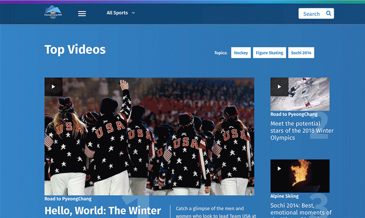
Online + Digital
Our brand design system had a broad online presence. We developed layouts for streaming services, app templates, interactive digital screens, ad banners, social media ads, and more.
One of the main goals of having a strong online presence was to let the consumer know all the possible platforms and ways to see their favorite sport or event at any time.

Outcome
The main goal of this brand campaign was to create engagement and awareness with consumers, viewers, and advertisers. NBCUniversal’s coverage of the XXIII Olympic Winter Games in PyeongChang, South Korea averages 20 million viewers in primetime over 18 nights.
I had a great experience working on this project. I am proud of the results and hard work invested by our creative team. One of the challenges along the way was to make sure other designers and teams interpreted the brand identity and use of watercolors appropriately.
We developed 4000+ assets that contributed to the most successful and engaging Winter Games.