nbc
National Broadcasting Company | Brand Refresh
branding, art direction, visual identity
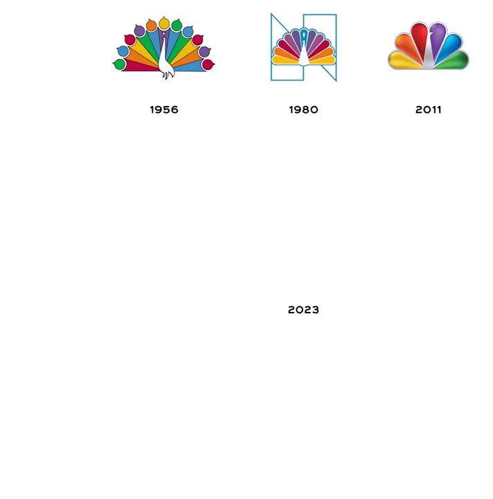
NBC’s brand refresh reimagined one of America’s most recognizable symbols, the peacock, for a new era of digital storytelling and streaming. Designed in partnership with Sibling Rivalry Studio, the update modernized the network’s identity while preserving its heritage, ensuring consistency across broadcast, digital, and global touchpoints
Logo
Our new logo honors the legendary bird icon with streamlined simplicity and clarity.
Over 97 years, NBC's logo has evolved many times, with each change reflecting the network's growth and technological innovation. For this next chapter of NBC, we freed the bird of its outline and opened up the spacing of the feathers to allow for increased legibility and scalability across all platforms and screens.
Color
NBC has a proud history of pushing the boundaries of possibility, reflected in its original storytelling and inclusive culture.
The showcase NBC's vibrant spirit through an ever-changing spectrum of gradients. By mixing and remixing the colors of NBC, we reinforce the endless possibilities for creativity that the network fosters. These colorways provide a backbone for the identity, creating a home for content, graphics, and typography.


Design system
To amplify brand recognition, we created an ownable system that leverages the feathers from NBC's iconic bird. The feathers can hold content, frame talent, and move dynamically, allowing for versatility and flexibility within NBC’s brand DNA.


Outcome
-
As NBC expanded across streaming and digital platforms, its previous logo and visual system struggled with scalability and cross-platform consistency. The goal was to refine a legacy mark to work seamlessly across every screen and format — from broadcast motion IDs to mobile interfaces.
-
Simplified the iconic peacock by removing the white outline, widening feather spacing, and brightening colors for stronger clarity and digital performance.
Enhanced the mark’s sense of motion and personality by emphasizing the central “beak.”
Developed a flexible design system where the peacock’s feathers became modular graphic elements for framing, motion graphics, and content storytelling.
Introduced a refreshed sonic identity, updating NBC’s historic chimes for modern broadcast and streaming environments.
Rolled out progressively across all NBC platforms beginning in late 2022, aligning broadcast, streaming, and promotional assets under a unified system.
-
Created a scalable, consistent identity optimized for multi-platform storytelling and digital clarity.
Strengthened brand cohesion across NBC’s 227 million U.S. adults and 1 billion global touchpoints.
Supported NBCUniversal’s broader transformation toward data-driven, full-funnel brand experiences — driving an 18% lift in ad-environment performance across its ecosystem.
Reinforced NBC’s dual mission: honor legacy, drive innovation, and expand cultural relevance across generations and screens.
-
NBCUniversal Creative Group, NBC Entertainment, Sibling Rivary